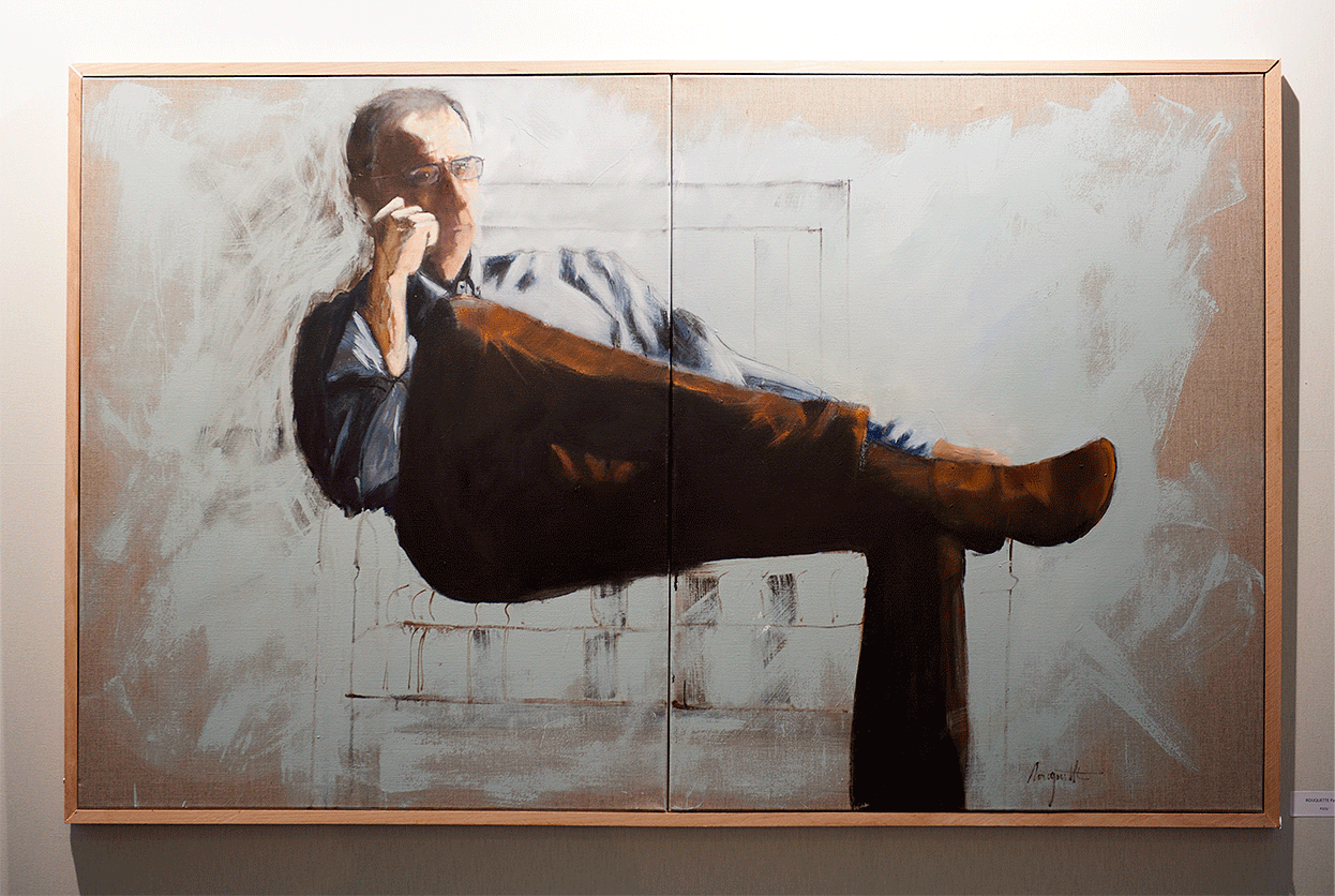
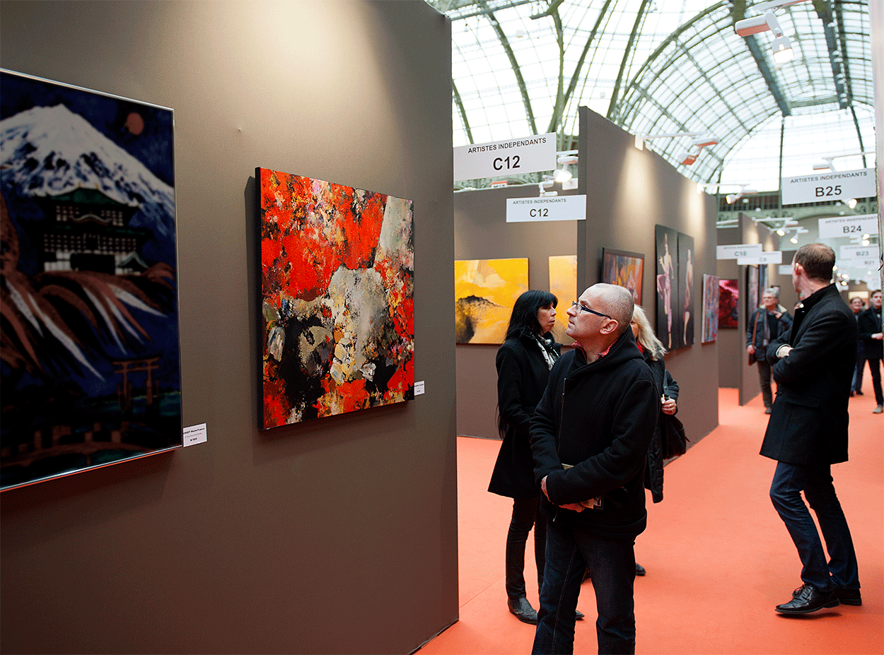
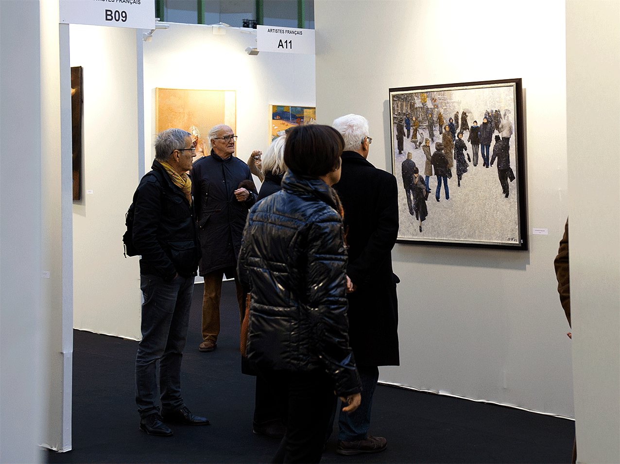
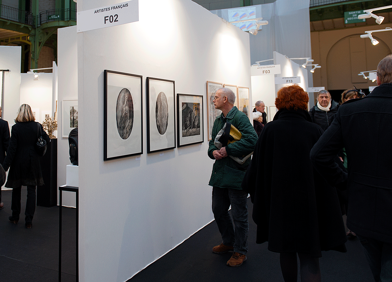
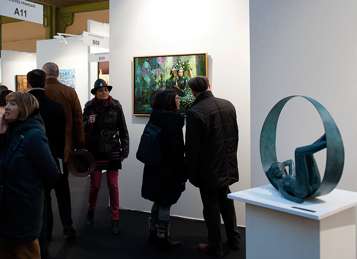
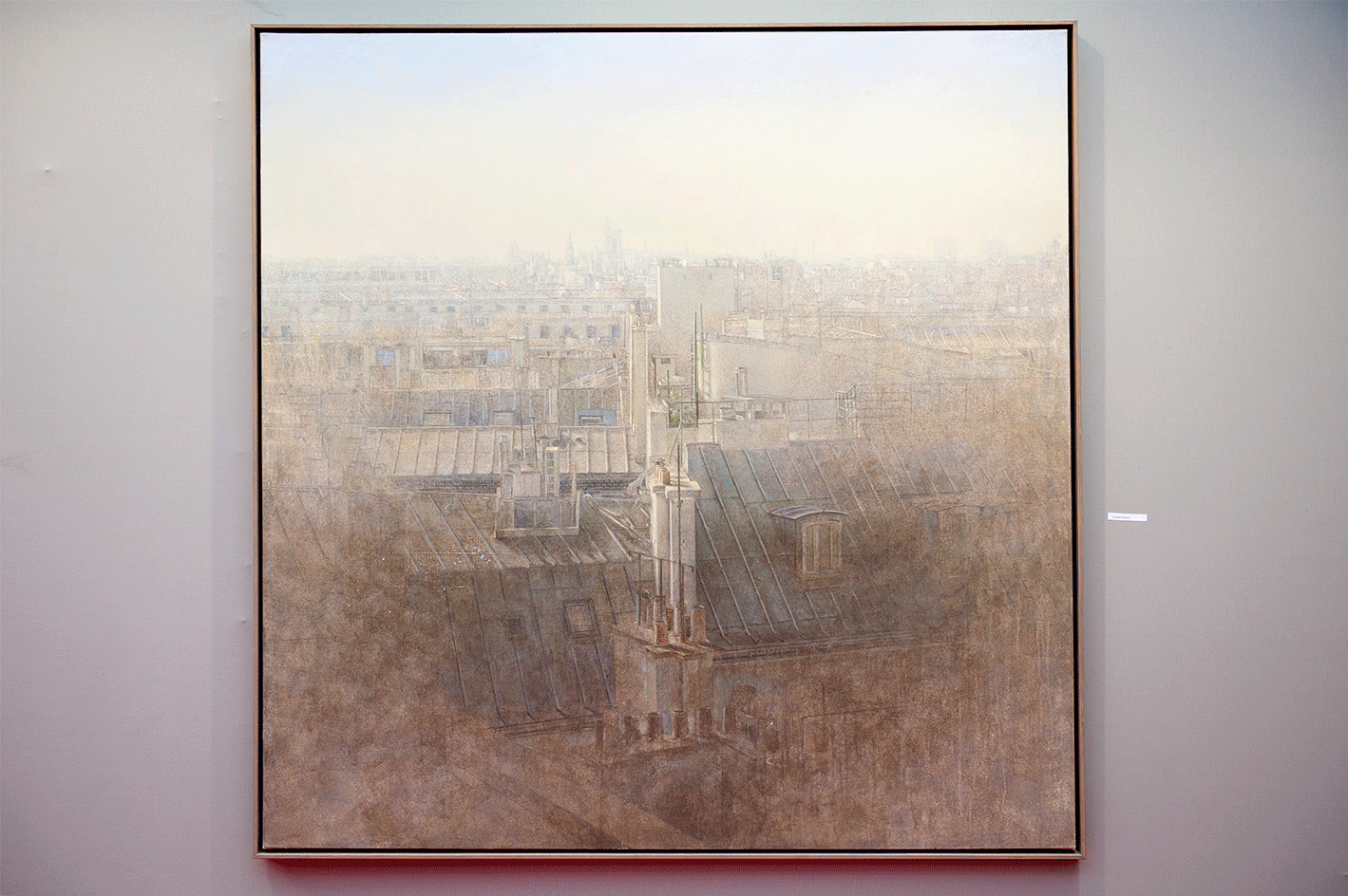
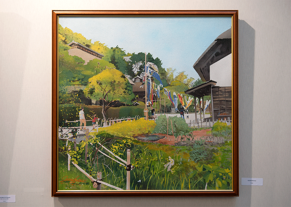
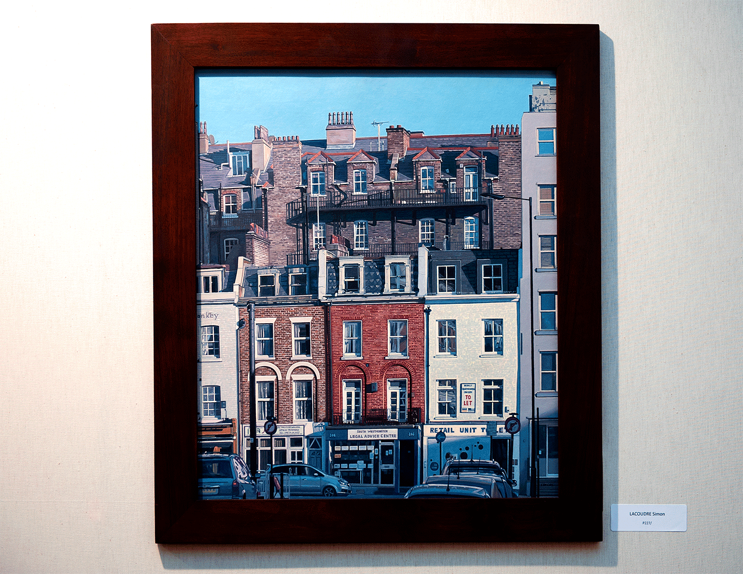
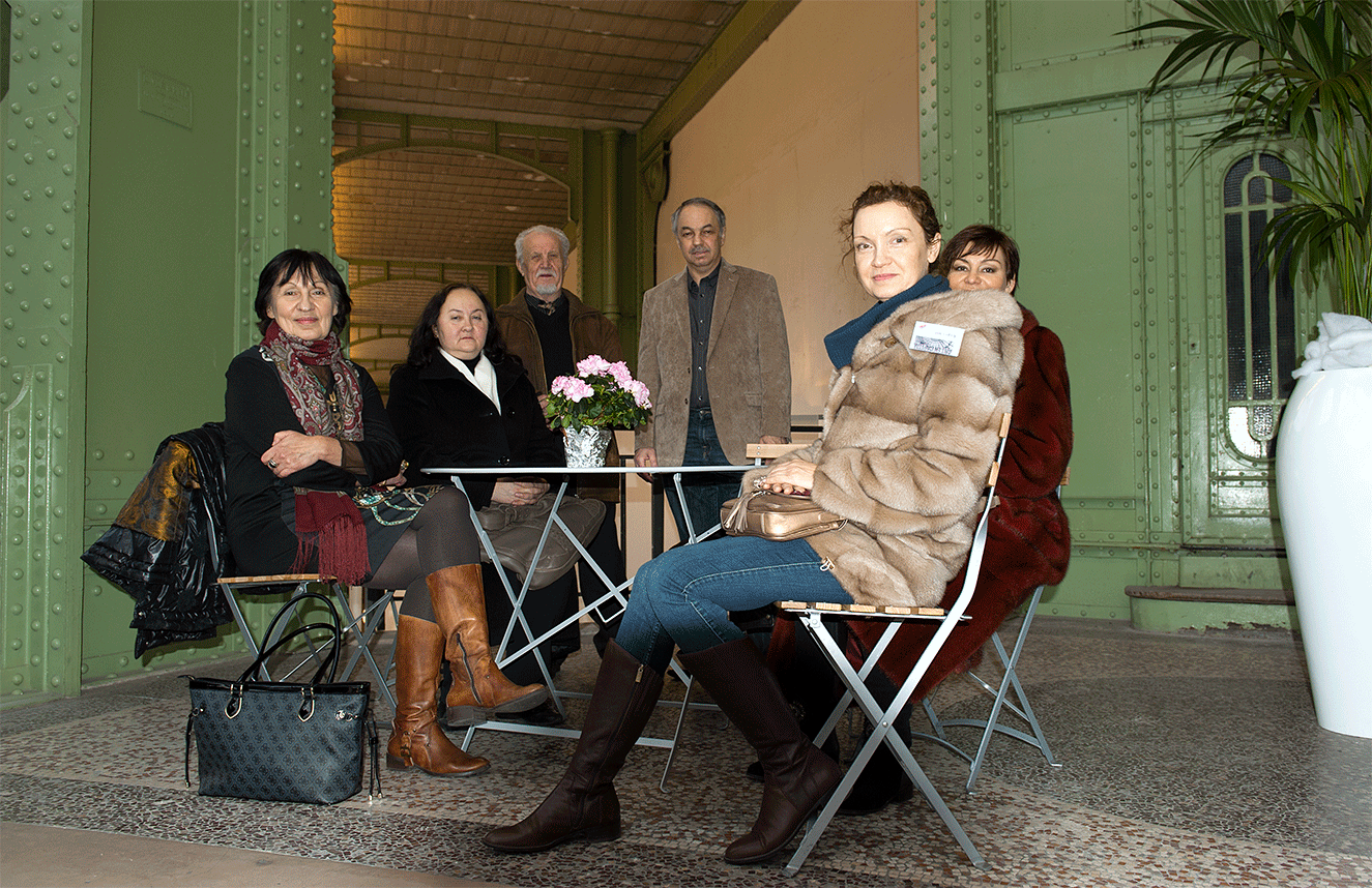
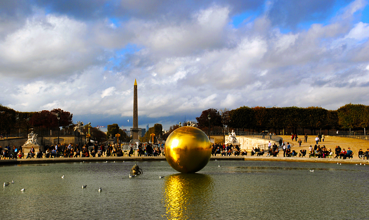
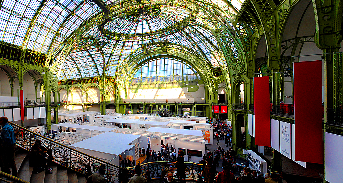
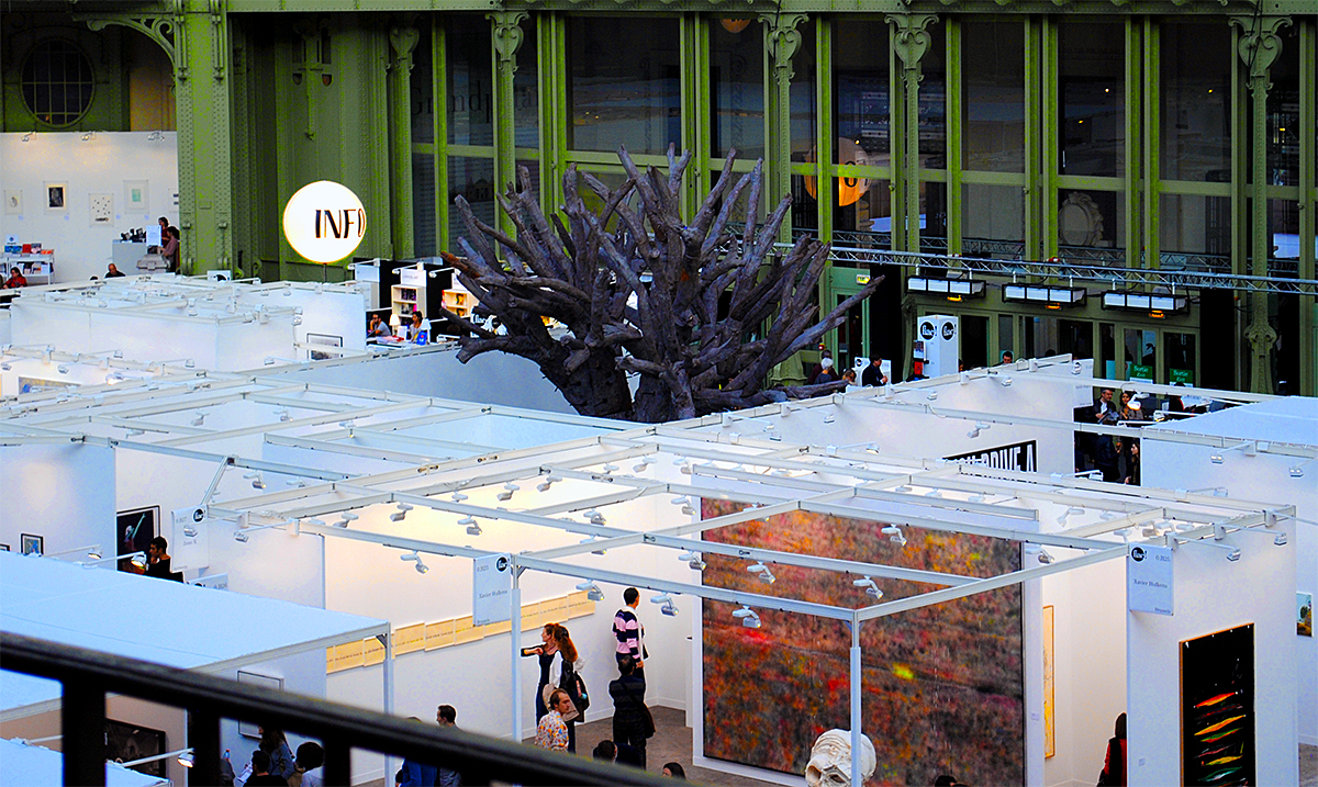
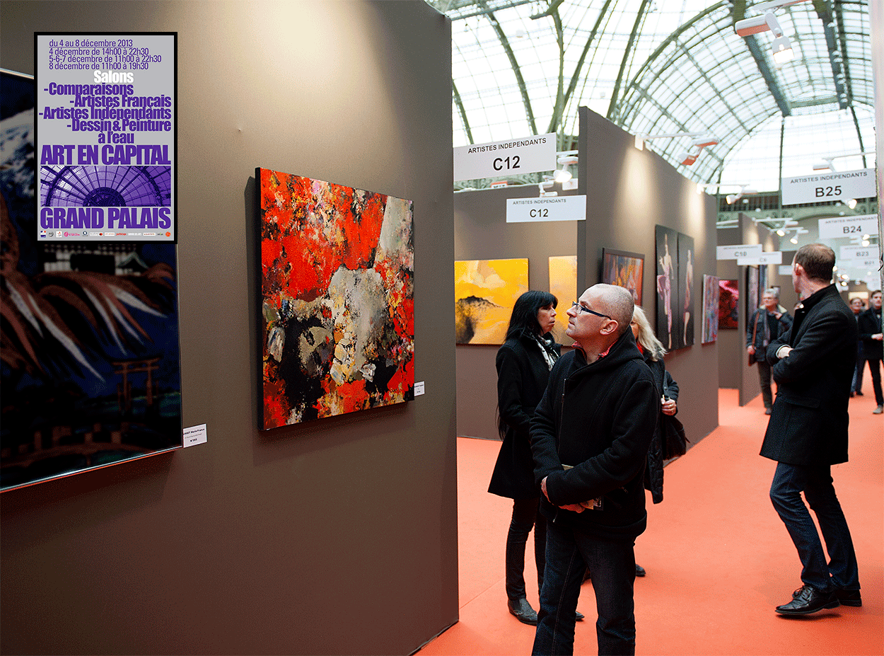
THE EXHIBITOR OF THE SALON “ART EN CAPITAL” 2013 – 2014
 The Arts – are fragments of a lost paradise, and the task of the artist, is to try to collect them. The difficulty lies in the fact that art is not life itself, but rather its reflection. Attempts of a literal copying of nature in painting do not reach a result, because the real-life object and its image in the plane have a different nature. In the 20th century, art has significantly transformed: in addition to the indisputable realism with its deep penetration into the essence of being, there is now impressionism, with its elements of pure color, and also the avant-garde with its innovative formal quests. I’m interested in the stylistic achievements of each of these areas: they complement and enrich one other. The main aspect of art – to create works that could “hook” the soul of the viewer, stop it, and make them think. Particularly this event – the pause before any artistic canvases, instantaneous concentration of attention on painting, transforms a participant of a gallery into an audience. The most valuable of all things is our life. Humans are given a unique opportunity to explore the world, to think, to dream, to love, and if they are also given the gift of creativity – it is a huge responsibility, as if every artist comes into this world with a certain mission. Another and very important thing – has he realized it or not, has he understood himself, has he received the necessary proficiency and the ability to clearly express it … At the end of it all, for his own creative talent, he is personally responsibility before God.
Vladimir Shichkov for the readers of the ”Russian Art & Paris”.
.
.
 In the present, there exist many artists, preserving the traditional commitment of art, but being absolutely modern in their worldview. Their artwork in which there is a free transformation of natural forms and a subjective interpretation of the visible, acts in opposition to the naturalistic paintings of the recent past, which imitate the lifelike. The figurative meaning of paintings by such masters is difficult to comprehend. The artist seeks not to as much visually reconstruct objects as to inspire viewers with artistic images, to cause a certain mood. Departing from external naturalism involves the activation of a counter spiritual perception from the viewer. The depiction of expression in these canvases, dominates the goal of portrayal. The drastic emancipation of painting from the tasks of fable narrative requires updating of the language of depiction.
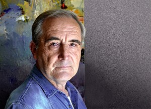
• Such work is done by artist Vladimir Shichkov. His artistic formation and development, it would seem, did not foreshadow this turn. For years, he repeated the fate a painter quite traditional in subject matter and in style. Apparently, it could hardly be expected from him to have drastic changes in both. But the era of rapid shift of the entire political and cultural life of the country has awakened many. Almost complete cessation of state patronage in the arts freed artists from the persistently imposed criteria. Vladimir Shichkov was sensitive to the challenges of the time.
• From imitation painting, visibly object-based, he came to the artistic decisions, residing at the boundary of a complete loss of natural object. The reduction of material forms as if not at all hinders the master. On the contrary, it seems to him as a particularly attractive way to strain the viewer, to give him the possibility of different interpretations of what he saw, but within the originally specified emotional range, as is the case with the experience of musical tune. The boundaries of possible interpretations are deliberately vague: the artist emphasizes the emotional beginning, not the figurative meaning. In the internet age, the visual culture of the viewer fundamentally changes. And above all, it concerns the extraordinarily sped up pace of showing. Flickering frames, the surprise and showiness of viewing angles, dissonances of color, blurring of contours – all this has become natural and habitual to the modern man. The view from the window of an express train or a speeding car, significantly changed the way we experience the world, and could not have avoided the visual arts.
• His paintings sometimes differ from the natural world. These artworks 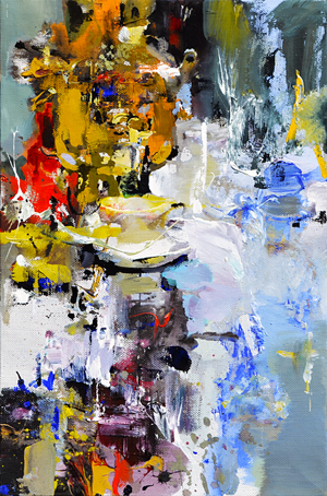
 ignore the density, weight, and material tangibility of the portrayed objects. Vladimir Shichkov attains an associative resemblance with the object, working largely in favor of his own enacted fantasies, freely transforming the outline, color palette and texture of objects in any motives. Hardly marked outlines, the quaint and moving kaleidoscope glow permeated by vibrating color stains, give birth to a special aesthetic emotional vagueness, a fleeting illusory, “where precision is fused with fluctuation” (P.Verlen), unwittingly awakening our imagination as well. These canvases are viewed as more flattened, they delineated a decisive turn to pure decoration. The unique features of this artist’s creative style are: improvised variations of bright imaginary landscapes; fragile, transparent silhouettes of flowers; demonstrative artistry of writing; cursory informative content of the plot; free emotional response to what is seen; expressive movements towards heightened-color painting; quite flawless artistic intuition.
• In a recent review of his solo exhibition at the Ivanovo State Art Museum, it was not accidentally said: “The artist balances on the verge of figurative painting and abstraction – a fascinating act of equilibrium.” Note that this is not without reason. The coloristical intensity of the canvas is held by the clashes of the thoughtfully rhythmic decorative spots. This reinforces the intensity of perception of the almost intangible materiality barely showing through the figurative motif. It seems as if the artist paints colored light, creates a luminous painting on glass – a kind of stained-glass feature to his paintings markedly magnifies their decorative-poetic beginning.
• All of his work, labeled by critics as “artistic equilibrium” seems like a spontaneous outburst of emotions carried onto the canvas at a rapid pace, executed in a live sketch-like manner; but such an impression can be misleading. By his own admission, they were born painstakingly. They were not a freestyle improvisation, but rather a deliberate desire to make the image and its perception by the view more dynamic. While seemingly without structure, these paintings are well made and designed to fulfill their main function – become an emotional dominant of residential or office interiors. Hence the desire for the external showiness, color harmony, and predominately sunny disposition of the emotionally-shaped structure.
• Honing his individual style, the master creates many paintings varying on the theme of color richness of the visible world. Vladimir Shichkov artistic creativity increases markedly from year to year. A direct appeal to the legacy of Impressionists or the quest for the artistic avant-garde are characteristic of the era of postmodernism: poly-stylistics become the style of our time. Today’s avant-garde artists actively make use of the achievements of predecessors. Already in the 1910s avant-garde started becoming more academical and there originated an avant-garde salon, which in our time decisively wins the sympathy of the audience, contemporary art galleries, and private painting collections. The achievements of Vladimir Shichkov are a visual confirmation of these tendencies. The processes of globalization are truly planetary in nature and necessarily pull into its orbit of influence even the most remote corners of the Earth.
by Efim Vodonos,
Honored Artist of the Russian Federation,
Director of the Russian art department of the Saratov State Art Museum
named after A. Radischev.
.
____
Pictures in the text (from above):
“Breakfast” Oil on canvas. (40 x 60 cm); “Pushavka” Oil on canvas. (60 x 80 cm).
.
.
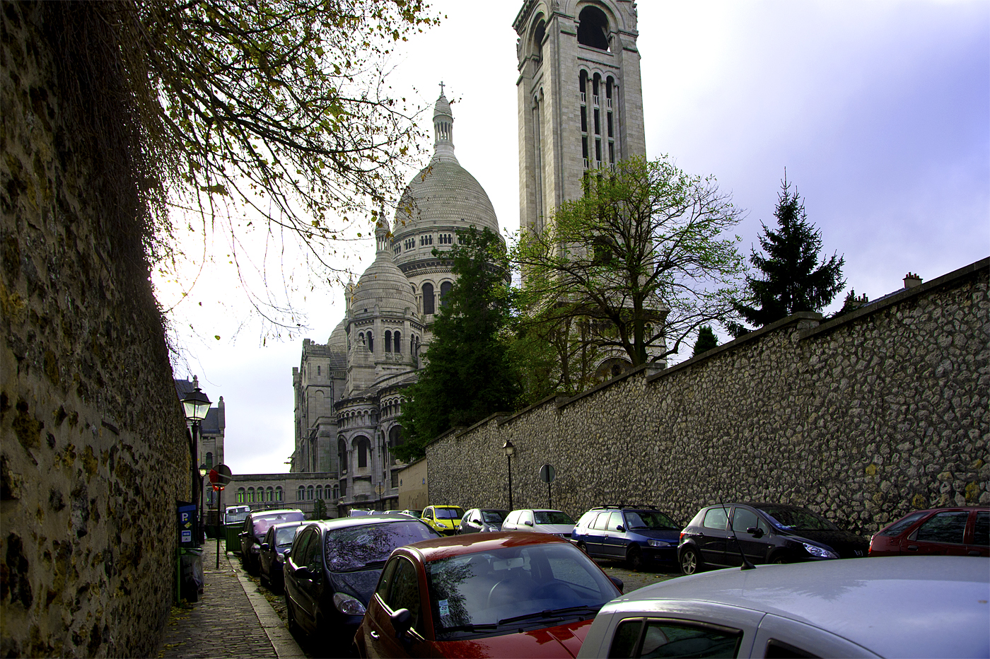
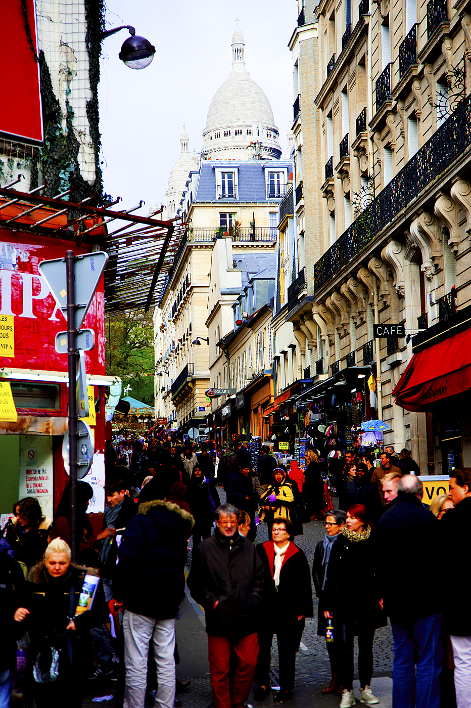
 “Paris” Oil on Canvas. (70 x 70 cm)
.
* * *
Thinking about the aesthetics of Vladimir Shichkov, noting how precisely the color chords of his works are composed, the term “poetry” involuntarily comes to mind. Concepts, which are used in the theory of poetry seem to be quite adequate for the artistic analysis of the pictorial composition of this master. Rhyme is a measured pace, the rhythm of sound. This definition is most relevant to the creative work of Vladimir Shichkov. The rhyme of color is at the foundation of his amazing and exceptionally attractive artworks.
• Let’s look at a little artistic miracle – “The Indian Summer”. Or at the no less charming – “The Flare” and “The Morning”. What is special about these compositions, which at first glance have quite ordinary plots? Is the innovative character of the artwork? Sure. Excellent color scheme? Absolutely. But apart from these purely artistic aspects, there is another dimension that is absolutely humanitarian – humanity. Peering into the coloring of paintings by artist Vladimir Shichkov, listening to the monologue of his paintings, the conclusion has to do quite unexpected. These bright, juicy, and externally flashy pictures lead their conversation with the audience in a surprisingly calm and warm voice. What gives them such a sound? First of all – the rhythm, the movement of the main color harmonies in the plane of the visual field. In the brilliant landscape “The Indian Summer” this can be seen most clearly. The rhythm of the main color masses with perfect precision builds the theme of the works – the warm calm of a clear autumn day.
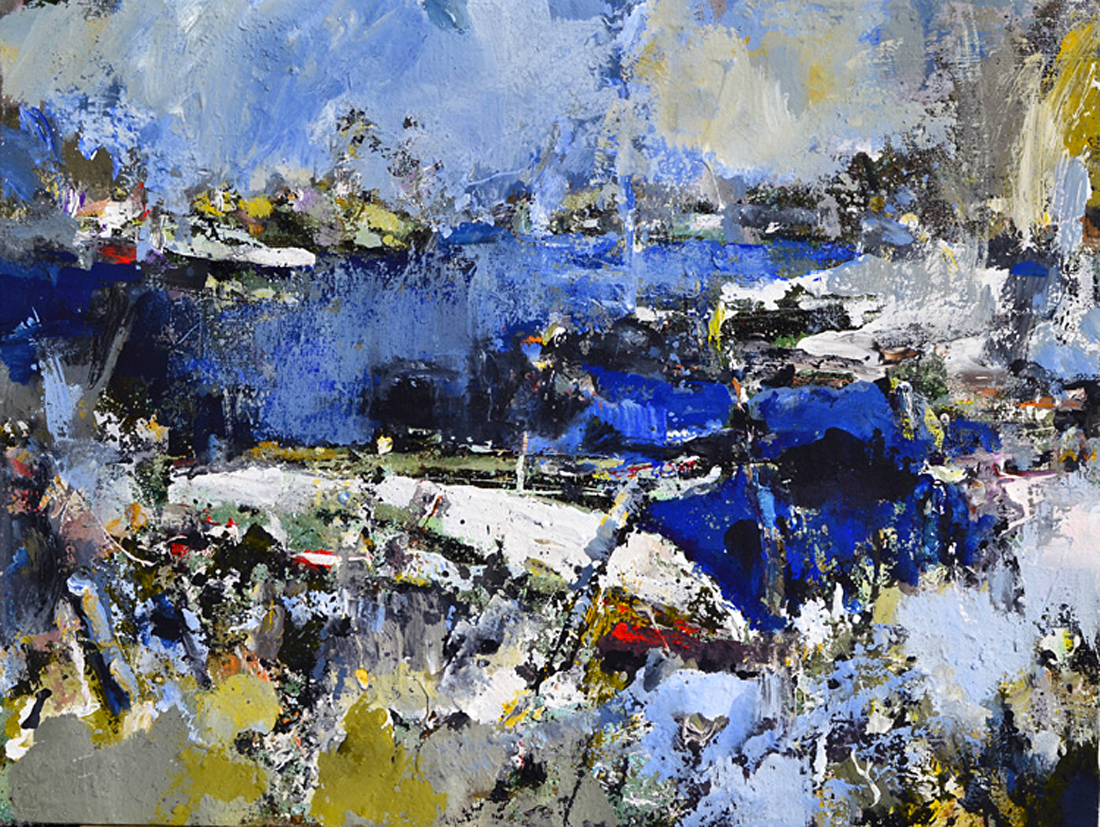
• Much more complex in its compositional and rhythmic construction is the landscape “The Coast”. With a high level of color intensity and strong contrasts, it still retains, however, a sense of comfort of human presence. The rhythm within it is set by the mass of blue color, penetrating the whole composition, and effectively ”soothing” the fractional, ringing rhythm of light accents. Rhythm, so to speak, regulates the timbre of the artistic voice – somewhat quiet, somewhat emotional, but never rising to a scream.
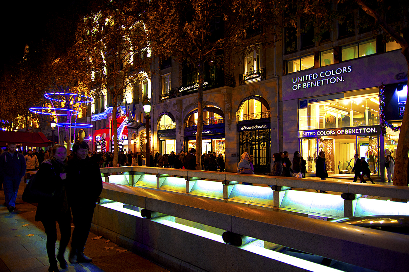
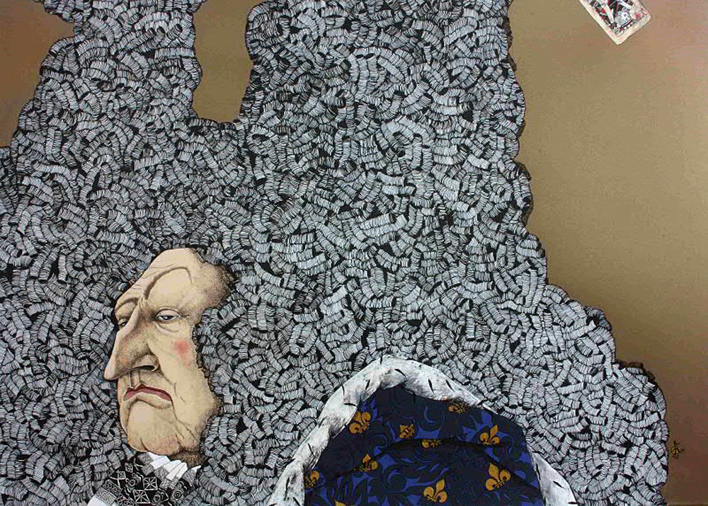
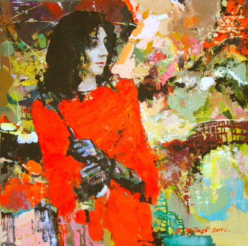
• The subtle understanding of plot in the figurative compositions by Vladimir Shichkov (“Paris”, “Premier”, “Nocturne”, “Giselle”) is present despite the artist favoring a close-up view. This is a remarkable quality. A close-up view, the rise of an image of human body to the boundary of a canvas, complicates the plot possibilities of the composition. Of all the active tools, the only one left at the disposal of the artist is, perhaps, the gesture. The gesture is understood as a meaningful movement of the entire human body. Could a gesture become the plot of an artwork? The composition “Paris” answers this question quite vividly.
• The language of artwork by Vladimir Shichkov is a profoundly original phenomenon. This language is not always easy to understand, but the expressiveness of this language, its artistic values and its possibilities are obvious. No less interesting are questions that arise among this. One of them, maybe the most fundamental, concerns the relationship between the planarity of the whole picture and the three-dimensional nature of human images on the canvas. In this special language, being developed by the master, the “conflict of interest” between these two basic categories looks to be inevitable. Or is a compromise still possible? Artist Vladimir Shichkov is actively working, and his answer will probably not keep you waiting too long. ©
by Russian Art & Paris
.
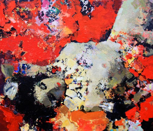 “The Dream” Oil on Canvas. (60 x 70 cm)
Paintings by Vladimir Shichkov – are a kind of visualized dreams of that which is beautiful. Colorful dreams. The unique feature of the realm of dreams – is a wonderful combination of incongruous things, where everything visible is transformed in unexpected ways, shapes flow into one another and change before our eyes. In a stream of bright and saturated colors, the image slips away. In the next second the “frame” changes, and you will no longer recognize the previously seen picture… Looking at the paintings of Vladimir Shichkov, you seem to be immersed in the contemplation of a colorful sleep. But unlike fleeting dreams, you can return to the artistic canvas again and again to look over the features.
Victoria Solnceva, art critic,
Research associate of the Ivanovo State Art Museum.
.
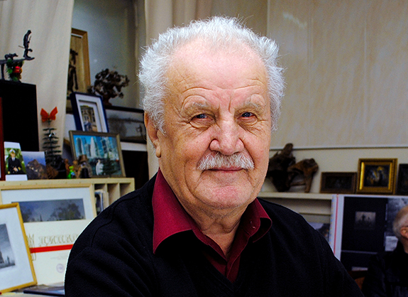
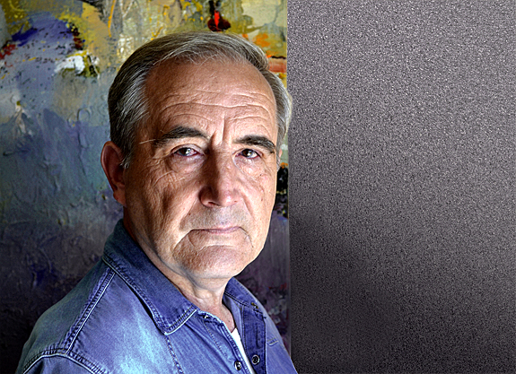
Vladimir Shichkov was born in the city of Ivanovo in 1951 year. After graduating from the Ivanovo Art College (1981), the artist was trained at the Moscow Art-Industrial College (the former Stroganoff College) under the guidance of docent Staborovsky (1983). Since 1990 year, artist has participated in art exhibitions and competitions. The paintings of Vladimir Shichkov are in the collection of the Ivanovo State Art Museum.
.
EXHIBITIONS
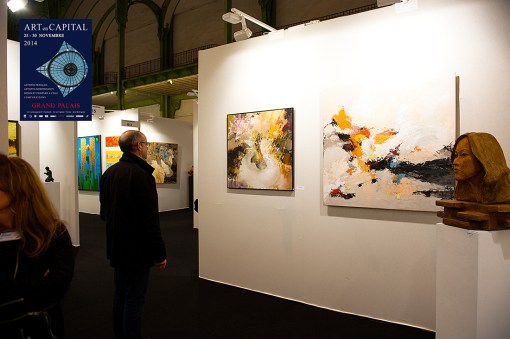
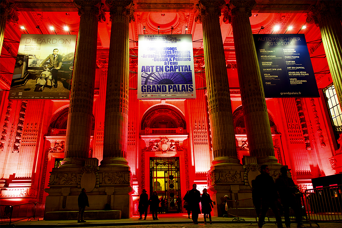
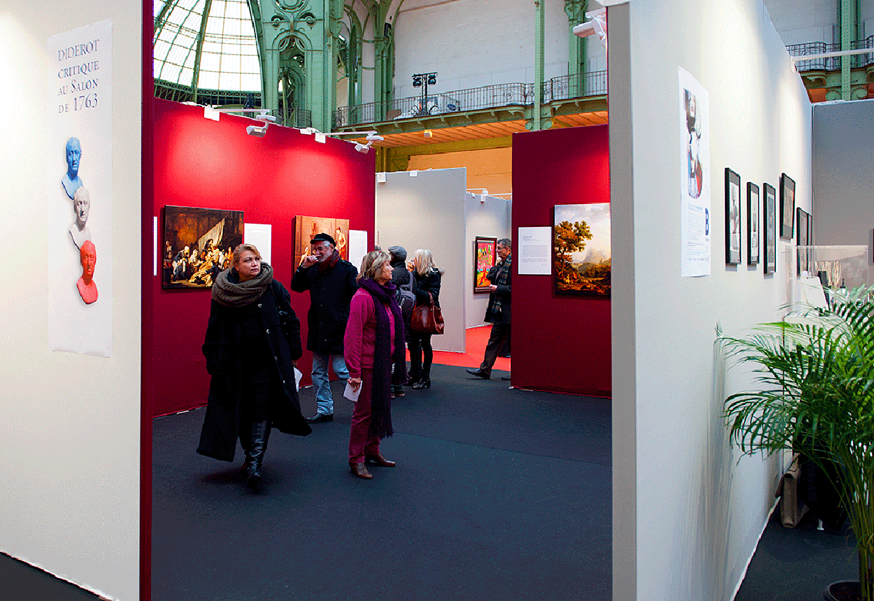
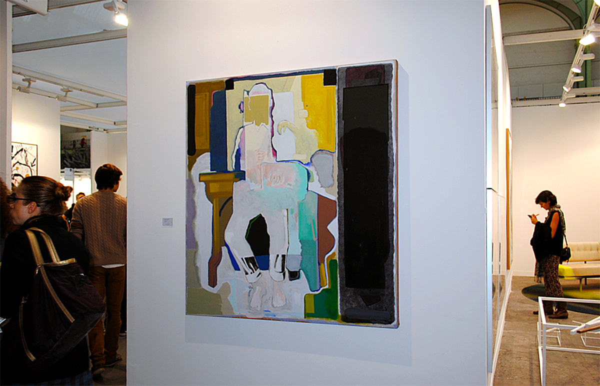
Painting by Vladimir Shichkov in the exhibition of the Salon “Art en Capital” 2014, (Paris).
.

Painting by Vladimir Shichkov in the exhibition of the Salon “Art en Capital” 2013, (Paris).
.


.
.
.
.
Russian spelling: Художник Владимир Шичков, (Пучеж)
.
.
.
.


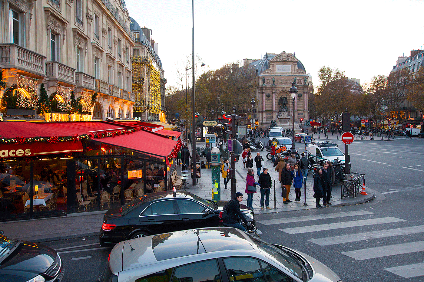


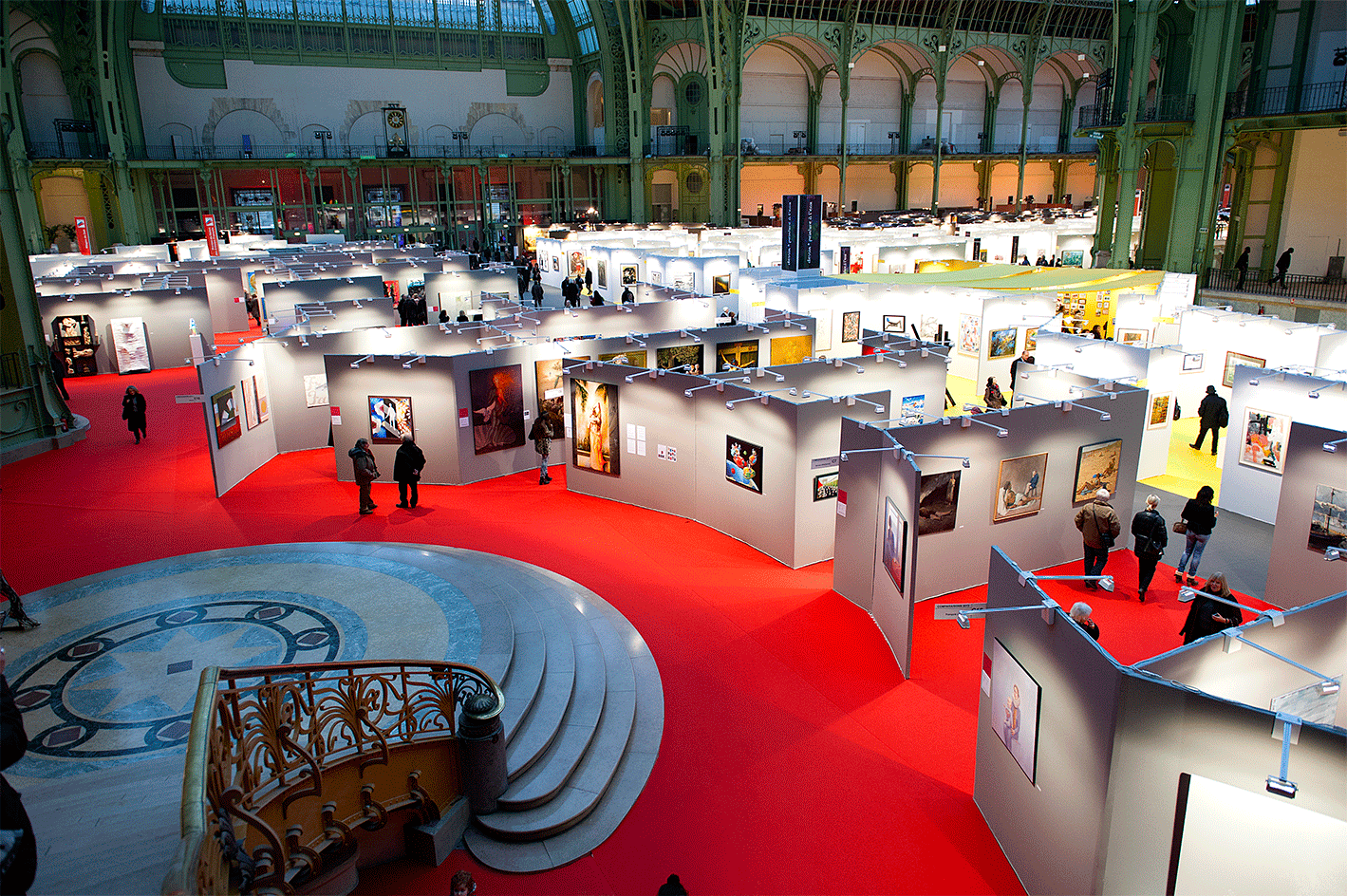
 11. Place Colette.