THE “RUSSIAN ART & PARIS” INTRODUCING:

I always considered it very important to preserve the picture’s plane as single entity, as a given. The illusion of deep space destroys the natural two-dimensional feature of the image on the canvas. I have realized long ago this hidden, mysterious law of painting and always strove for wholeness of the original plane. This flatness of the image, newly re-open by the artists of the twentieth century, is definitely one of the most important phenomena in the painting of our time.
I often transfer successful discoveries made in watercolor to oil painting, on canvas. It is possible in that sense, that I was influenced by Cezanne. The unpainted canvas ground – is transferred from watercolors. These omissions are natural part of the composition, just like a pause in a musical piece. The pause is significant for all types of art, and perhaps in painting it is still underrated. In music, its sound is always changing – it is constantly in motion. What about in painting? How can an artist coordinate movements of light and color masses in the real visible world, with the space of the canvas, which is unchanging? Hence, painting must be different …
Yuri Larin for the readers of the ”Russian Art & Paris”.
.
.
.
“Failures? … I do not know. I always moved forward.”
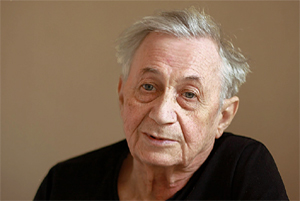
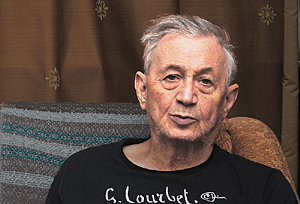
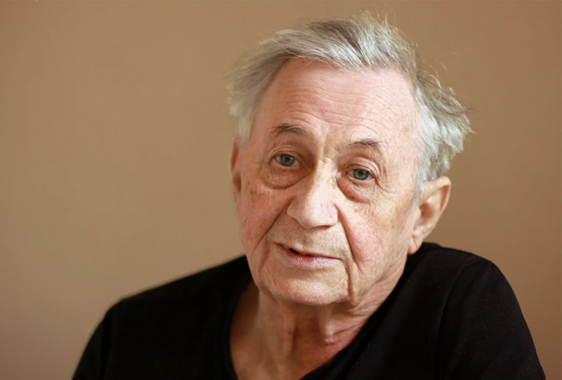
Interview of the artist Yuri Larin for the “Russian Art & Paris” journal.
.
RA&P: – Yuri Nikolaevich, the history of Russia in the twentieth century is tragic. What events of this history make you feel optimistic?
Yuri Larin: – Optimism is generally characteristic of the Russian people, even though there has been a lot of grief. This includes my life. But I always got lucky with good people and friends. I am grateful to my relatives who raised me like their own son, until they themselves were arrested. I gratefully recall the Akhtubinsky orphanage; I am still friends with the son of the orphanage director Vladimir Klimov. In 1990’s, when the redistribution of property took place in Moscow, my workshop was taken from me and I was forced to vacate the premises within five days. Then the wonderful doctor Alexander Konovalov, who had operated on me twice, helped temporarily store my artworks in the basement of the Institute of Neurosurgery. Vladimir Lukin and Yury Karjakin helped me get a new workshop. Even in hard times, most people remain human – I always noticed this.
RA&P: – The cultural history of the past century is complex and diverse. What events in the field of culture do you consider most significant?
Yuri Larin: – If you consider the field of literature, there were wonderful poets: Mandelstam, Pasternak, Zabolotsky… In the field of Russian art I love Russian avant-garde of the first half of the 20th century: Tatlin, Malevich. I was greatly influenced by their younger contemporaries, the representatives of “Jack of Diamonds” – Kuprin, Konchalovsky, Falk and other followers of Cezanne. This is not an exact answer to your question, but for me, Cezanne remains as an unshakable, cornerstone figure in the visual arts. All Russian art of the early 20th century was influenced by Cezanne. The publishing house “21 Century” will soon release a book by Elena Murina on Paul Cezanne. This is the first great book about his work that is written in Russian. I like how the art developed in Russia after the revolution. When the revolutionary romanticism ended, a period of conservatism began. This was a huge loss in the sense of the formation of artistic idea and artistic image. Then visual art started to recover, but not in the direction which I expected.
RA&P: – What do you think about the present state of art in Russia?
Yuri Larin: – This is a very bad time for my evaluation of contemporary art. Not everyone will be happy. What I see is a degradation. There is an abundance of artists for whom the plot moves away, presents itself at an almost unconscious level, and leads to a loss of art image. The so

 called modern painting is a loss of meaning. For me the absence of formal visual objects does not mean the complete rejection of meaning. Meaning is not literary content. The meaning of painting – it is a spiritual beginning, which is always present in the work of art. Harmful commercialization, the pressure of popular culture on the artist leads to a downfall in artistic level, the loss of meaning.
RA&P: – Many your artworks are on display today in the largest Russian museums.The road from first sketches to great museum collections has been both long and difficult. Is there a sense of satisfaction today?
Yuri Larin: – Recognition came to me only in 1982 year. It was an exhibition at the Moscow Theater of Yermolova. My work got there thanks to my friend, artist Valeriy Volkov. In 1989 year, after the first major solo exhibition placed in the Central House of Artists, many museums have purchased my artworks. One of my biggest successes, I think was the solo exhibition in the Saratov State Art Museum of Radishchev in 2004 year. Subsequently, this museum acquired some of my paintings. In recent years, a lot of my works (drawing and oil) appeared in the Russian Museum’s collection. Perhaps this is the ultimate dream for any Russian artist. On the other hand, an artist can feel famous when his paintings become famous. In this sense, I still have room to grow …
RA&P: – What was the most important thing that you have managed to achieve, or perhaps understand, as an artist?
Yuri Larin: – Over my years of work, I have experienced a transformation of my artistic vision. At first, my ideal was the so-called landscapes of condition, and I was pleased when I was able to depict a rainy, foggy or evening environment. Since about 1974, I noticed that in watercolor paintings I had made, there appeared an increasing amount of deformations of space and generalizations of real objects in color masses; from this, the work of art would become more seamless and musical. Starting from 1976, I’m painting a little from natural life, and most of my watercolor and oil paintings are workshop’s works. These are the result of my observation of nature and the fixation in memory of the initial impulse, which is done with the help of a pencil drawing made on the spot. Good creative work must have two beginnings, i.e. should encompass both the visual and the musical side. Looking through my work, I realized that the good ones are those in which the struggle with the visual for the musical side reached its limit. The continuation of this struggle would have led to a complete loss of depiction, which means the loss of one of its two beginnings. I think that a work is completed upon reaching the limiting state of the transition from the visual beginning to the musical.
RA&P: – What paintings do you think are the most important in your work? Towards which of your works would you like to draw the audience’s attention in the first place?
Yuri Larin: – I work in three techniques: drawing, watercolor, and oil. For years, I created a series of watercolors in various locations: Moscow, Northern Italy, Germany, the Baltic States, the Yaroslavl region. In each of this series there are at least a few canvases which I consider significant. As for oil, the most important is considered to be “The white tree.” It is the most famous work, and is now located in the State Russian Museum. I would like to quote from an article “Authenticity of destiny” by Elena Murina: “… no wonder he so often says, always facing our modern politicized life – No, painting is better! as if reminding himself and others of the high calling of art to resist the worldly whirlpool and confusion of the senses. And in fact, looking at such a masterpiece, as “The white tree”, one can not but agree – Yes, painting is better! This canvas, where white, pink and blue, which are risky colors for painting, met and fused with each other, as it could only be in a sudden vision or beautiful dream, was created in a happy moment of creative completeness.” In fact, I think the most important artworks (landscapes, portraits, still life), are those in which I was able to bring my basic principle of the limiting condition. There are many, so it hardly makes sense to list them.
RA&P: – Have their been moments in your art life that you would regard as creative failures?
Yuri Larin: – Creative failures …. I do not know. I always moved forward. If I had an unsuccessful work, I simply did not show it.
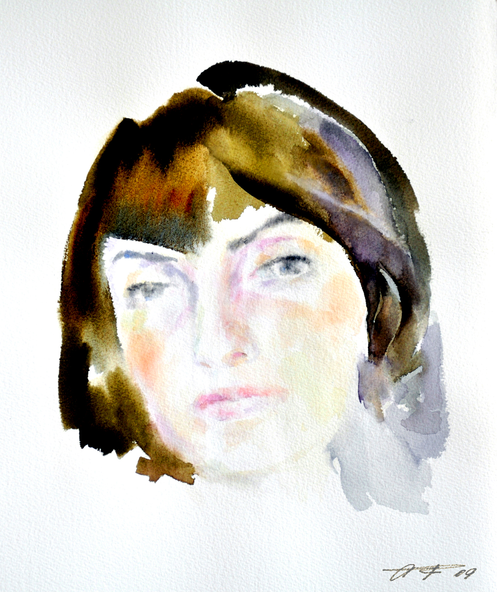
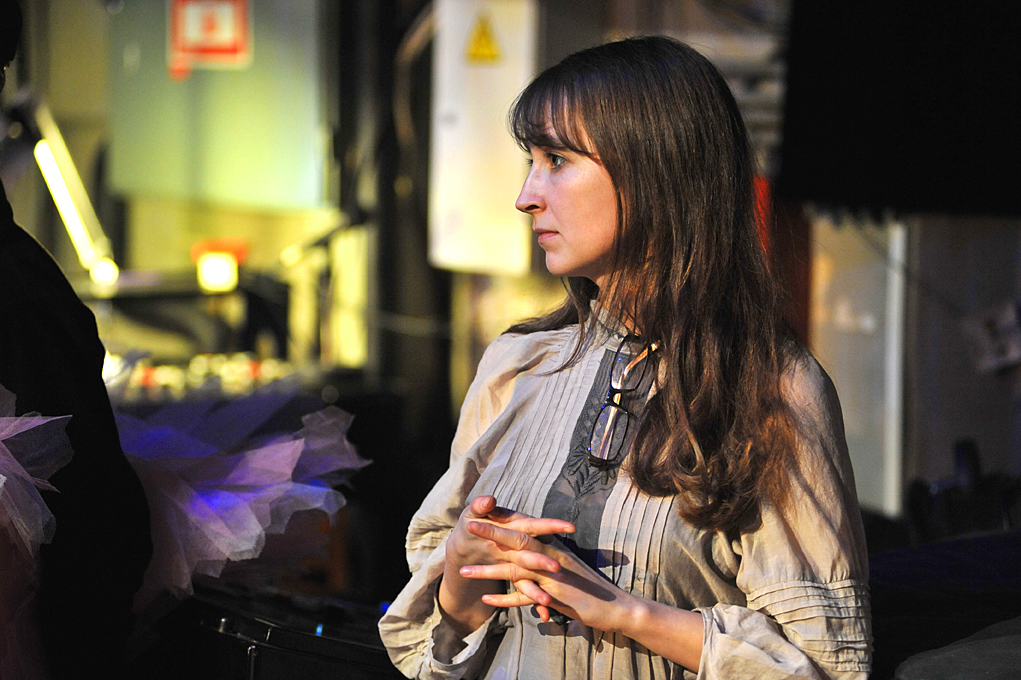
RA&P: – Right now, next to you is your spouse – Olga Maksakova. The role of Olga in your work – is it the role of a Critic or a Muse? What does she think about this?
Olga Maksakova: – I’m not a critic, because I do not consider myself a person competent in this area. All that I can say about the work of Yuri Larin, I learned from him. Prior to meeting him, I considered fine arts to be “third-rate”. Literature – yes! Music – of course, but not painting. When I first came to the studio of Yuti Larin, I had a cultural shock. After two hours of watching his work, it became clear: there is something strikingly important, which is beyond my comprehension. Well, for many years I humbly learn. So how can I be a critic? No critic, no Muse. I have the caring, saving role. “The Artist and the Muse” – this is not about us …
Yuri Larin: – Although there are 5-6 portraits.
Olga Maksakova: – Yes, and perhaps, when needed, I was a model. Discipleship is about what art can do to a person. Here is my first in a series of portraits. When it was created, it was obviously emotionally important to me – how gradually my picture appears and solidifies on the canvas. And then, looking at the finished thing, I was suddenly conscious of myself as a professional; I realized what allows me to be a therapist. It is this flow, the streaming lines, their interaction with stable color spots in the background … So Yuri among other things played a significant role in my professional life. ©
Note: Olga Maksakova – PhD in Medical Science, psychotherapist, leading researcher of the Institute of Neurosurgery named after N. Burdenko.
On August 26, 2012 from Moscow.
Copyright by Russian Art & Paris.

.
.
AUTHENTICITY OF DESTINY
(Excerpt)
It would seem that Yuri Larin, who works in a free style of relaxed brushstroke and color, is far from direct appeals to any recognizable sources. Not betting on “originality”, he nevertheless reached the uniqueness, which is evident in his attitude for both the subject and the material  of painting. First of all, this personal tone is associated with the impression of sincerity and dignity. This belongs to art that does not base itself on “success” and “self-assertion.” And one cannot but see the similarities with the figure of Yuri Larin, an artist who is undoubtedly focused not on himself but on painting, far from the hustle of the artistic “vanity fair.”
• Painting entered the life of Yuri Larin, as a happy reward for the courage and sacrifice it took to become an artist. On his way to an early-recognized vocation, he faced many obstacles: orphanage in childhood, tragic fate of parents N. Bukharin and A. Larina, the need to keep “in the  shadows” by selecting some mediocre profession. Only at the age of thirty, Yuri Larin risked starting over his life and applied to the Stroganov School, from which he graduated in 1970. Today behind him is a long path: tireless work in various media, participation in many exhibitions, teaching in the Art School “Memory of 1905”, and creative trips around the country and abroad. After his first solo exhibition in 1982, Yuri Larin gained the reputation of a serious artist among the few fans and followers of “pure” painting.
• The social and aesthetic problems of the end of the 20th – beginning  of the 21st century, more and more greatly replace painting on the periphery of artistic life. Therefore greater value is held by the standoff of its supporters to a disastrous process of rejection of art from the creative work culture created by the efforts of great artists of the twentieth century. Yuri Larin confirmed his belonging to the heirs of this culture, which was based on object-formative principles dating back to the work of Cezanne. Of course, he is is not a “Cezannist”, which would be an anachronism today. In general, its interaction with the riches of the classical pictorial heritage has no specific addresses. But when he recognizes “the conflict between the pictorial and musical – the eternal subject of painting” (the words of Yuri Larin), when he recognizes the art of painting as “the struggle of depiction with musicality”, his connection with the discoveries of Cezanne becomes apparent.
by Elena Murina, art critic,
member of the Union of Artists of the Russian Federation.
_____
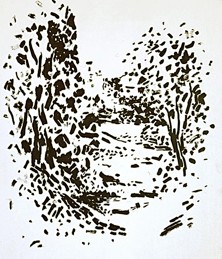
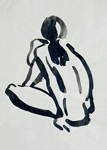
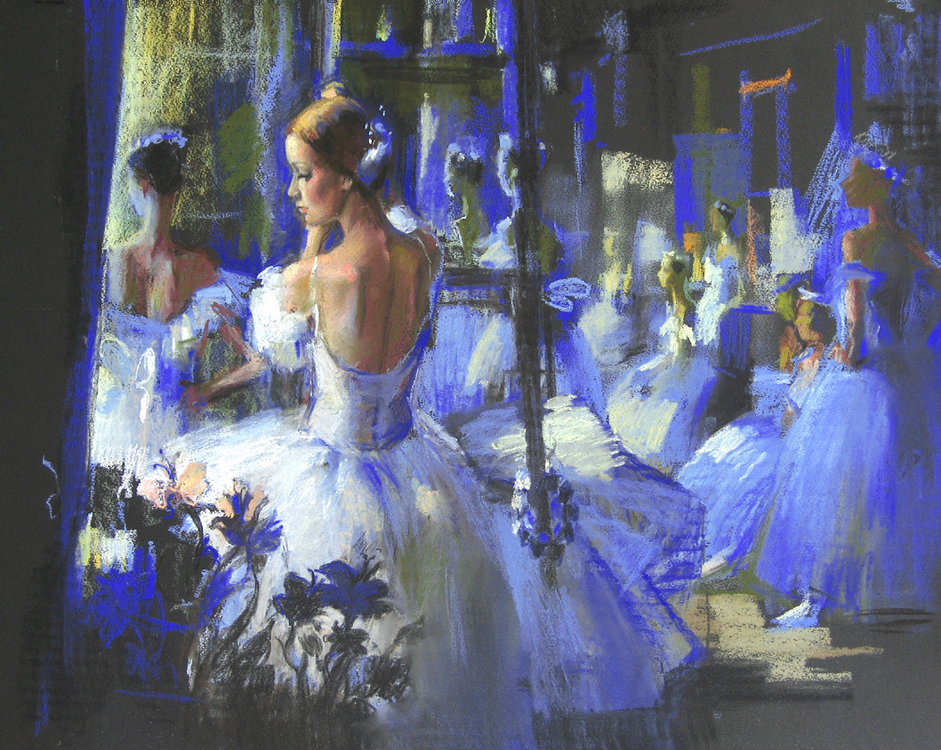
Pictures in the text (from above):
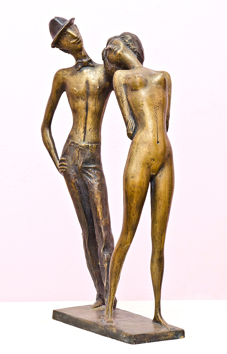
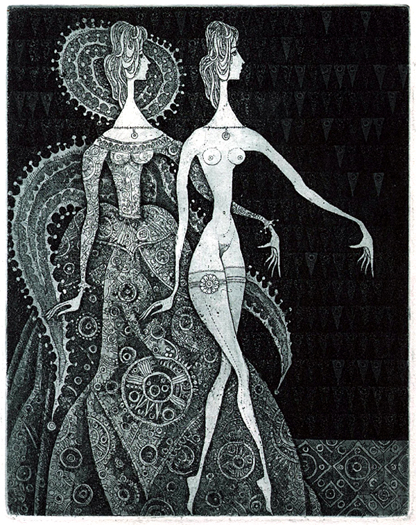
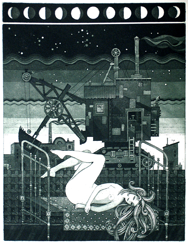
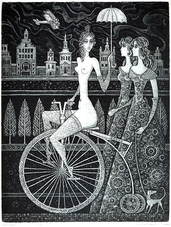
“Settlement Garciems” Ink on paper. (50 x 43 cm); “In the woods. Latvia” Ink on paper. (49 x 42 cm); “Nude” Ink on paper. (41 x 19 cm)
.
.
 “Church of the Ascension. Kolomenskoye” Oil on Canvas. (100 x 100 cm)
.
“… specifically the sense of musicality is what keeps the memory of the first encounter with the work of an artist. This softly melodic sonority of each canvas constitutes the essence of Larin’s paintings. Rejecting the entertainment of the plot, not pursuing an active expressiveness of form, Larin concentrates all efforts on the harmonization of the spiritual color image. Guided by a sense of harmony, the artist appeals to a corresponding sense in the viewer, bypassing the rational, literary-descriptive capabilities of the image. The more it moves in that direction, the more difficult it is to find words that can express the complex range of feelings, the aesthetic empathy that arises at a meeting with his paintings. With all his work, Yuri Larin seeks to comprehend the soul of the phenomenon of painting, to create pure painting in every sense of the word.”
May Miturich, People’s Artist of the Russian Federation, winner of the State Prize of the Russian Federation, member of the Academy of Arts of the USSR
.

“Road in the mountains” Oil on Canvas. (65 x 73 cm)
.
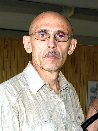
Larin Yuri Nikolaevich, a painter and graphic artist, was born in 1936 in Moscow. He is the son of the prominent Soviet statesman Nikolai Bukharin and Anna Larina. After the execution of his father and the arrest of his mother, he was raised by relatives – Boris and Ida Guzman (1938-46). After the arrest of B. Guzman (1946), at the age of ten, Larin was brought up in an orphanage in Stalingrad (Volgograd). At the age of twenty, when Anna Larina returned from Stalin’s concentration camps, Yuri Larin first learned the name of his father – Nikolai Ivanovich Bukharin (1956). Yuri Larin graduated from the Novocherkassk Engineering Institute, worked as a water engineer on the construction of the Saratov Hydroelectric Station and in the Engineering design organizations (1958-60). Together with his mother, he received permission to return to Moscow (1960). In 1960 he began studying at the People’s University of Arts named after N. Krupskaya in drawing and painting department under the guidance of A. Trofimov. He graduated from the Moscow Higher School of Industrial Art (former Stroganovskoye), with teachers: Professor I. Lamtsov, Professor G. Lyudvig, Docent V. Pashkovsky (1970). Yuri Larin taught at the Moscow State Academic Art College in Memory of 1905, (1970-1986). He has participated in art exhibitions since 1970. Yuri Larin is a member of the Union of Artists of the USSR (1977).
The works of artist Yuri Larin – painting and graphic art are in the collections of museums:
The State Russian Museum (Saint Petersburg); The State Tretyakov Gallery (Moscow); The State Museum of Oriental Art (Moscow); Saratov State Art Museum named after A. Radischev; The State Historical and Architectural Museum “New Jerusalem” (Istra); Dilijan branch of the State Museum of Folk Art (Dilijan); Combined art museums and centers of aesthetic education of the Udmurt Republic (Izhevsk); The Volgograd Museum of Fine Arts; The Tomsk Regional Art Museum; East Kazakhstan Museum of Art; The Nizhny Tagil Museum of Fine Arts; The Moscow State Vadim Sidur’s Museum; Andrey Sakharov’s Museum (Moscow); The State Literary Museum (Moscow); The Collection of the Heinrich Böll Foundation (Berlin).
.
.


.
.
.
Russian spelling: Художник Юрий Ларин, (Москва)
.
.
.
.


")


